

Large donations attract attention because a single figure can seem to explain a complicated race. But the number alone cannot tell a reader who controlled the money, when it became available or which activity it supported. A useful reading habit is to slow the story down: identify the source, follow the recipient and check the dates before drawing a conclusion about influence.
I. Start With the Money Trail
A starting point is the public record. The Federal Election Commission makes candidate and committee filings available for research. Its data tools distinguish receipts from disbursements and allow readers to examine the underlying reports. That distinction matters when a headline moves quickly between the money a group raised and the money it has already spent.
Illustrative data only. These values reproduce a chart arrangement for a reading example; they are not verified donations by any person or organization. The total of the stacked bar already includes both segments.
Consider the chart here as a worked reading example, not a report about an actual donor. Two hypothetical periods show totals of $290 million and $366 million. Within the second bar, $90 million belongs to an earlier portion and $276 million to a later portion. The stack illustrates why adding a component to the total that already contains it would count the same money twice.
The identity of the recipient is another essential detail. A candidate campaign and an outside committee occupy different places in the financing system. Before comparing two totals, ask whether they refer to the same kind of organization. If they do not, present the difference clearly rather than combining them into a single competitive scoreboard.
II. Read Beyond the Headline
A spending story becomes easier to understand when it names the activity as well as the amount. An advertising purchase, a mailing and a field-organizing budget are different descriptions of how resources may be used. Their effectiveness cannot be read directly from the size of the payment. A careful account separates the recorded expenditure from any claim about what it achieved.
The FEC describes independent expenditures as communications expressly advocating a clearly identified candidate’s election or defeat without coordination with the candidate, campaign or party. That definition is narrower than the casual expression “outside money.” Readers benefit when a story uses the specific category shown in the records rather than letting a familiar label carry several meanings.
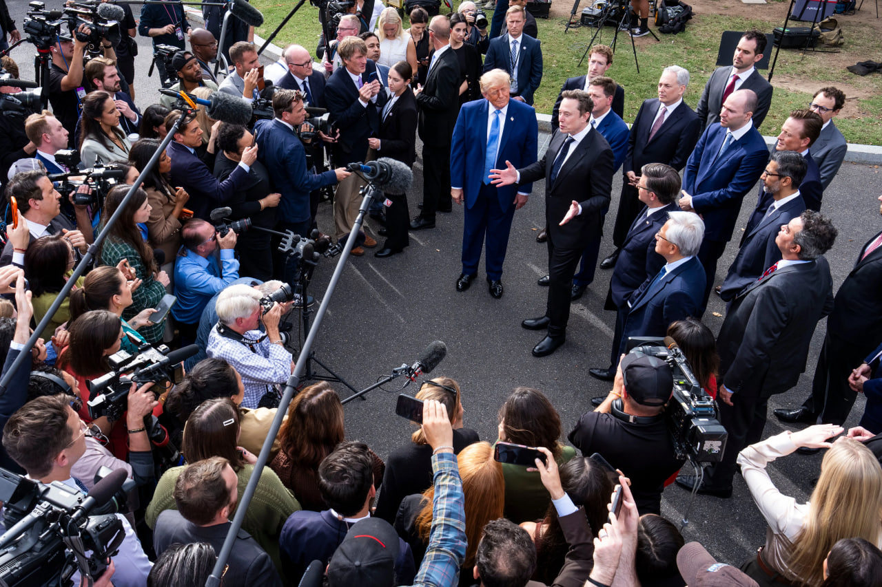
A press appearance can draw attention to a political relationship, but a photograph does not establish the terms of a financial transaction. The same discipline applies to an interview or a statement from an interested party. Attribute what the source says, distinguish it from what a filing documents, and leave room for information that has not yet been established.
“A useful number comes with a source, a period and a clear explanation of what it counts.”
— The Aster Ledger reading principle
III. Put the Local Story in Context
National totals can hide very different local stories. A state-level example is useful only if its boundaries are clear: which race, which organizations and which time window are included? A vivid image of a roadside sign tells a reader something about the setting. It does not, by itself, measure a campaign’s reach or explain how people will vote.

When a report compares spending across places, its method should travel with the numbers. Different definitions, reporting dates or groups of committees can produce totals that look directly comparable but are not. A reader can ask a simple question: would the comparison still make sense if every included category were written beside the chart?
IV. Keep Dates and Evidence Together
Timing matters as much as scale. A new filing may cover activity that happened weeks earlier, while a recent announcement may describe an intention rather than a completed payment. Keeping the date of the activity separate from the date of publication prevents an old transaction from being mistaken for a new development.
Public data are a place to investigate, not an excuse to stop asking questions. Search the relevant candidate or committee, inspect the report and note the period it covers. If a figure comes from a statement rather than a filing, keep that attribution visible. If a report changes, explain what changed instead of quietly replacing the earlier number.
V. Compare Like With Like
A comparison across election cycles needs a consistent frame. Full-cycle and year-to-date totals answer different questions; totals for one donor and totals for an entire network do too. The most useful chart is not necessarily the most dramatic. It is the one that lets a reader reconstruct how the comparison was made.

Money can help describe the machinery of an election, but it is not the election itself. Treat a financial account as a map of recorded resources, with a clear legend and visible limits. The result is a less sensational story and a more useful one: a reader can see what is documented, what is interpretation and what remains unknown.
Editorial note: this is an original explanatory example, not a report of new campaign donations. The chart uses illustrative values. Background definitions and research links come from the Federal Election Commission; reference photographs and layout come from the supplied page.